Wolfgang Weingart
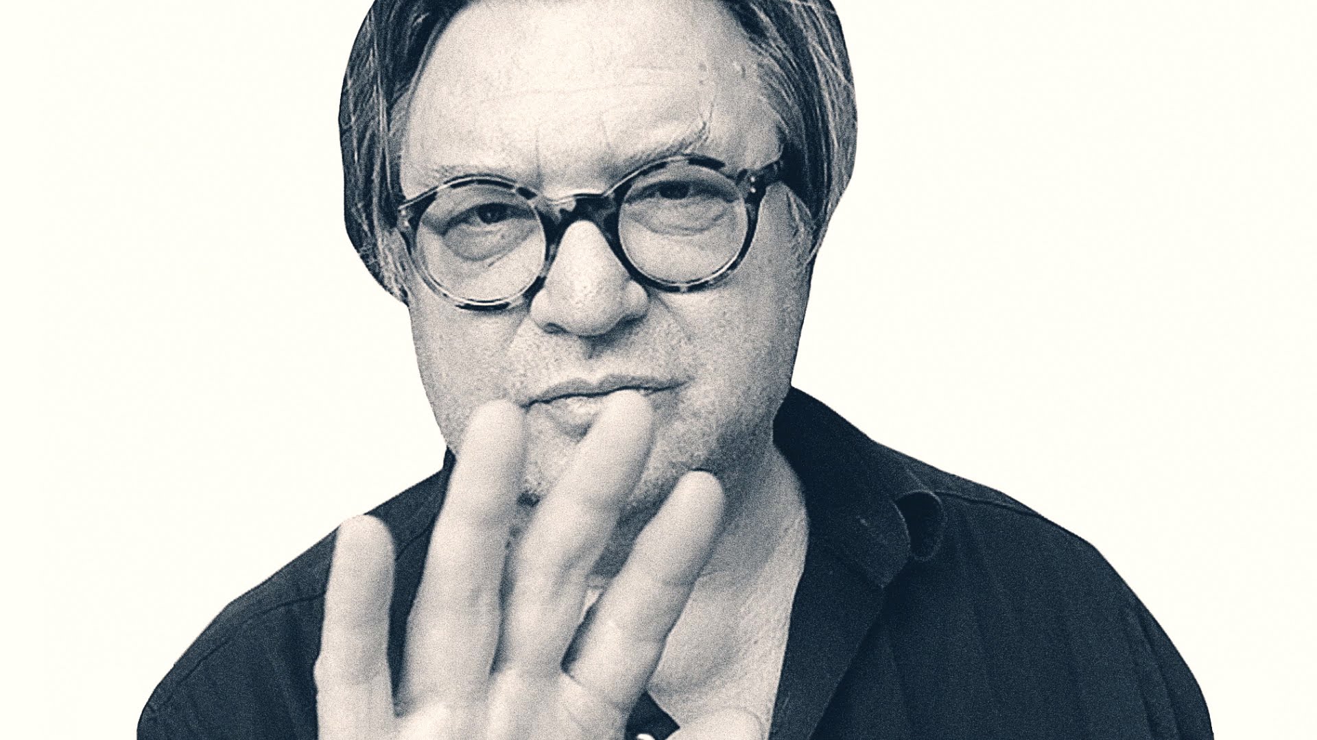
Designer and instructor Wolfgang Weingart is recognised for his typography explorations and teaching. Wolfgang Weingart is regarded as the ‘enfant terrible’ of modern Swiss typography. Born in 1941, Germany Weingart at an early stage of studying design he broke the established rules. He grew up post World War Two and in his home town Friedrichshafen, it was a subject for aerial attacks in the war. The attacks didn’t directly concern Weingart but he did experience them from a far.
Education
Studied at Merz Academy in Stuttgart where he attended a two-year program in applied graphics, he then enrolled at Basel School of Design as an independent student under the influence of Karl August Hanke. Hanke was a consulting designer for a company Weingart came in contact with. Weingart says he is someone who likes to create something with his hands, as he uses to take his bike a part and build it again. He also concerned himself a bad student as he stayed down a year three times due to not having the appeal cramming knowledge into his head. Due to the sack of interest in school he decided to change his career path and studied to be a typographer.
Its said that on his first day of Basel as a student they were asked to work on a line of composition using ruling pens; Weingart had other ideas and decided to go to the type shop and make a contraption that he could use him self to print lines. From that day on Weingart showed that he was unconventional in his work and it reflected on to his designs. In his book you can see the design that he created from the contraption he created using a plank of wood and screwed L shape hooks.
His experiments began when he started an apprenticeship. Curved mental rule was used to create circular compositions was part of his experiments as he liked to break the rules and push design to its limits. He was considered quiet the rebel when it came to design. He received some influence from the ancient stone construction which was located in the Middle East. To do further research he decied that traveling would be the best research he could do a first hand experience of the stone during the 1960s. The design of the artifact he incorporated it into a interwoven geometric text composings he designed. He had many influences in his life that where inspirations to his work but mostly it was him taking something so simple an changing it to his liking.
“I took Swiss Typography as my starting point, but then I blew it a part never forcing any style upon my students. I never intended to create a style. It just happened that the students, picked up and misinterpreted a so called Weingart Style and spread it around” —Poyno, Rick Eye, No.4 Vol 1 1994
His Work
Weingart’s experimental design approach and the connection between analog and digital techniques that he called for are topical again today. His life work is shown for the first time in Switzerland at The Museumof Design in Zurich which features Weingart typography.
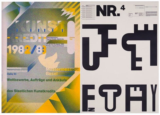
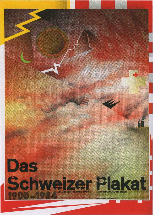
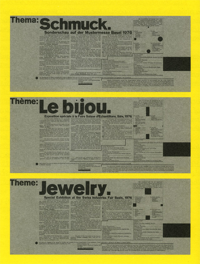
Weingart always constantly looked for new ways in which he could create illustrations. He decided to a adopt designs from benday films and halftone screens that are commonly used in photomechanical process. Reaching into his photography side he used a repro camera, which is a large camera that was used to reproduce important documents in offices. Weingart use of the tools was to blur, stretch and cut type as a new approach to design. This process aloud the design to tone letters and images. His sketches and mockups that where supported by yellowish tape revealed showed how his development process of ideas began. Designs that he did finish including the letterpress explores his experimentation into letters as there concrete forms and how he dismantled it. His published pieces that where printed by offset lithography where unconventional, bold, audacious and protrude. A short description of his work is that it is free yet controlled, compelling yet lucid.

Teaching
He began teaching when he was invited to Weiterbildungsklasses fur Grafik, a newly established institution’s to teach typography. He taught ‘international Advanced Program of Graphic Design, where he became an influential instructor until the year of 2005. He has taught some of the worlds greatest designers:
- April Greiman
- Jerry Kuyer
- Robert Probst
- Franz Werner
- Emily Murphy
- Jim Faris
His teaching practice was deceptively simple as student started of with considering the appropriate weight, size and style of the different letters also learning the proper letterspacing, leading and end of line as student designers back then did not have computers they had to print by hand so precision and alignment was a thing that needed to be learnt, so if the print didn’t look right the process would have to be repeated.
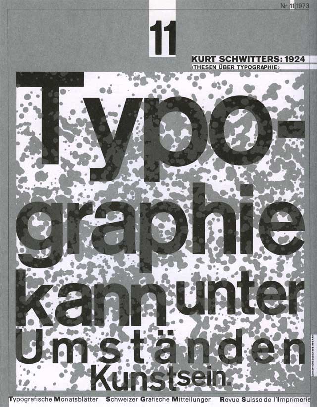
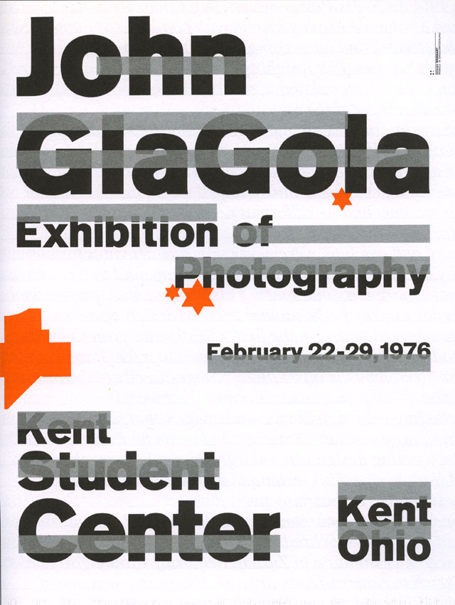
While Weingart was teaching he continued to proceed in his experiments and designs by creating famous designs such as ‘Typographicishe Monatsblatter magazine cover. He also designed for John Glagola a photographer, a poster of wide silver bars spread across the name of the artist. These pieces of work aloud Weingart to create in his own style while designing for clients. Juxtaposed with works produced through his teaching activity.
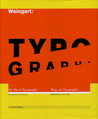
My Way to Typography
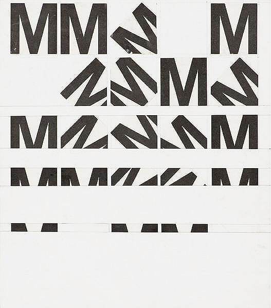
Weingart wanted to publish a book that would be different from all others. Typography: My Way to Typography was a book designed and authored by Wolfgang Weingart. The book contains 450 type illustrations, poster and photographs of his work. The book such areas that discovers Weingarts journey of the 40s to the 60s, the letter M, the Basel years and Typography in a new context. The boom was published in the year 2000. He spend five years putting the book together, gathering designs and writing a monologue of his life with design.
The Letter M was where he started the unconventional letter spacing, repeating the letter in different angles. The letter did not change size or weight, he designed the letter M in a square box placing it in different places in each box to get a different style but the M is still recognisable. This is where he learnt to manipulate letters.
Weingart created the book to learn and inspire others the world of typography. In his book Weingart showed how he experimented with dismantling the design grid, spaced, underline or reshaped them and reorganised type-setting. The book is written in part English and German. The book is a autobiography and portfolio of Wolfgang Weingart. The book is filled full of his work, its more of a sketchbook than an autobiography.
““I was motivated to provoke this stodgy profession and to stretch the typeshop’s capabilities to the breaking point,” —Weingart: Typography—My Way to Typography
New Wave/Swiss Typography
Known as ‘The Father’ of the New Wave typography or Swiss Punk. New wave or Swiss Punk is a postmodern language theory that was influenced by Punk. It defies strict grid-based arrangement conventions. The letterspacing, weight and sizes are inconsistent and set at non-right angles. The increasing expressionism within artist including Weingart, aloud them to get creative within there own bonds.
The Swiss Typography was designed though the teachings of Baushas in Germany post World War Two. After the world artist where looking for ways to become more expressive and recover from the depression of war. Weingart knew that typography could be transparent and unobtrusive way to communicate its textual content. The design of the word can be a description of what the word means.
Weingart was the creator of New Wave in the early 1970s. The inspiration for this design came for a number of factors including Punk, Psychedelia and corporate culture. The design breaks from the conventional structure as an artist freedom and a bold stairstep. Although the style can be set centre, ragged right, left or chaotic. In Weingarts work and designs for his typographic experiments Postmodernism and aestheticism had a role to play with the artist being more expressive which created some of the world greatest designs. The new chaotic, free style was an eye catcher to the public, which continued into advertising. Business contacting artist to create covers and posters to sell to the public as the style made people look twice and purchase due to the difference and expressive style. Weingarts students April Gremin and Dan Frideman both learnt the New Wave design from the creator and put their own twist on the style, April creating a hybrid imagery style and David deconstructive page layouts.
Weingarts was an experimentalist and due to his creative style and pushing the boundaries we have a style of design that is truly eye catching, lucid and exploratory.
“What still surprises and inspires me today: to turn blank paper into a printed page.” —Weingart: Typography—My Way to Typography
- Images https://i.pinimg.com/originals/cc/53/52/cc53526cd3bde1fb5210d69f936a3cc1.jpg http://www.designishistory.com/images/weingart/typography.jpg https://www.aiga.org/medalist-wolfgang-weingart/
- Research https://www.aiga.org/medalist-wolfgang-weingart http://www.designishistory.com/1960/wolfgang-weingart/ https://www.youtube.com/watch?v=WA5CYRrd8qo https://eyeondesign.aiga.org/museum-of-design-zurich-unveils-the-weingart-archive/
- Quotes Weingart: Typography—My Way to Typography Poyno, Rick Eye, No.4 Vol 1 1994